WHAT MAKES A GOOD REFERENCE PHOTO?
A painting made from a photograph can really only be as good as the photo. So what makes a good photo (for a painter)?
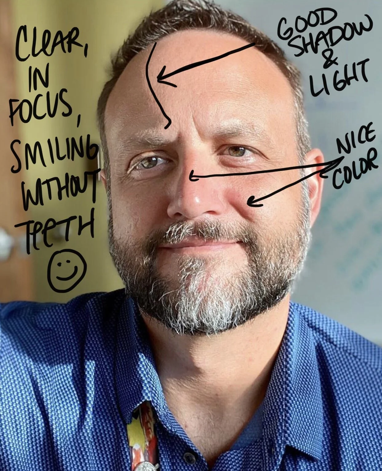
I don’t look at photos of you the way you might look at photos of you. To a lot of people, a “good” photo is one where they look slim, young, smooth, or made up. To me, a good photo is one where you look like YOU. Your wrinkles, scars, and splotches are all beautiful to me, and make you all the more paintable. But what REALLY makes a great photo to paint from is:
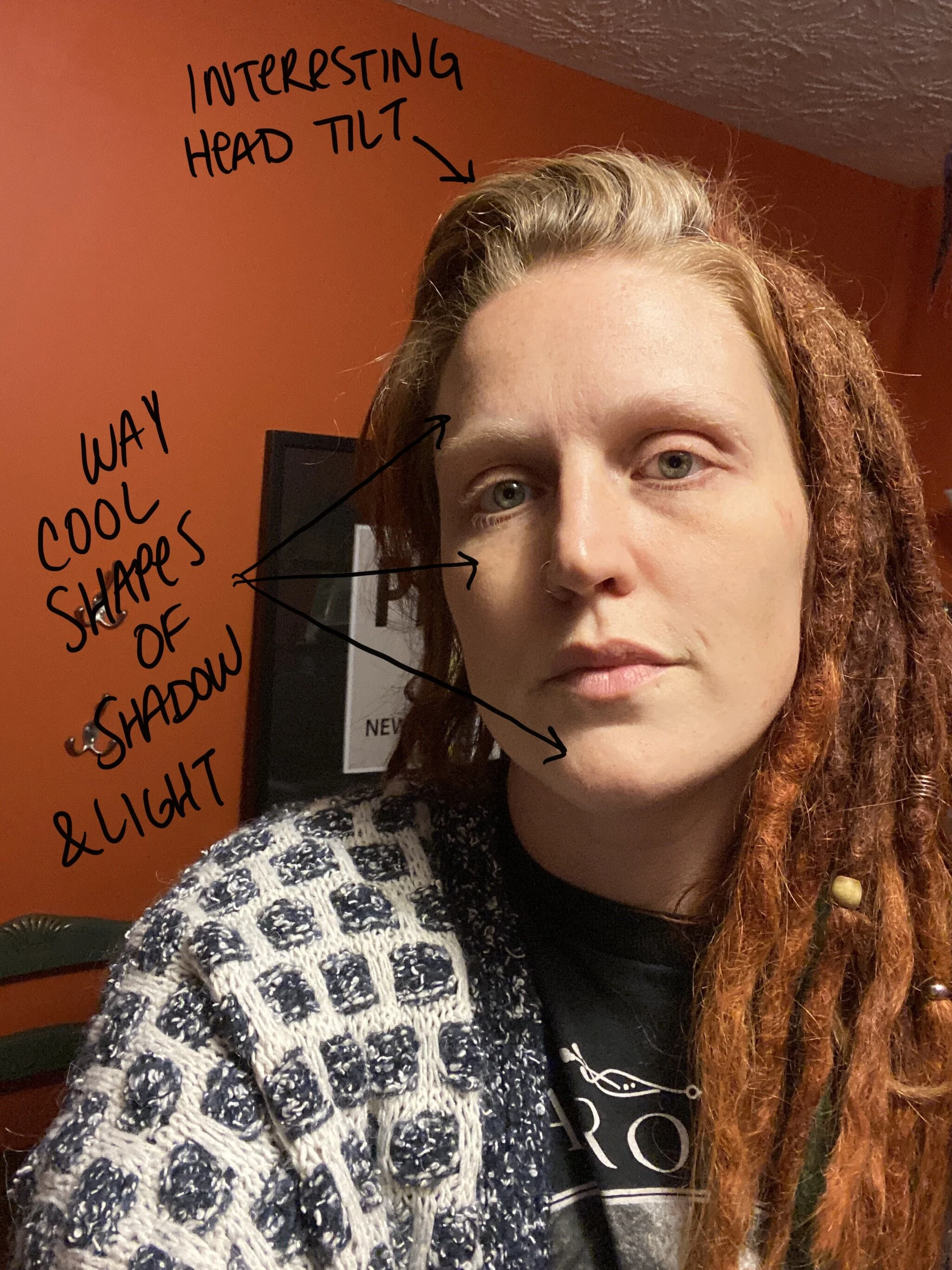
Angles. An interesting tilt of the head is always preferred over looking straight ahead or a side profile.
Light and Shadow. Shadows around eyes, cheekbones, or cast shadows under or beside a nose are all very helpful.
Color Variation. Sometimes really rosy cheeks or brightly colored eyes can make up for a lack of interesting shadows.
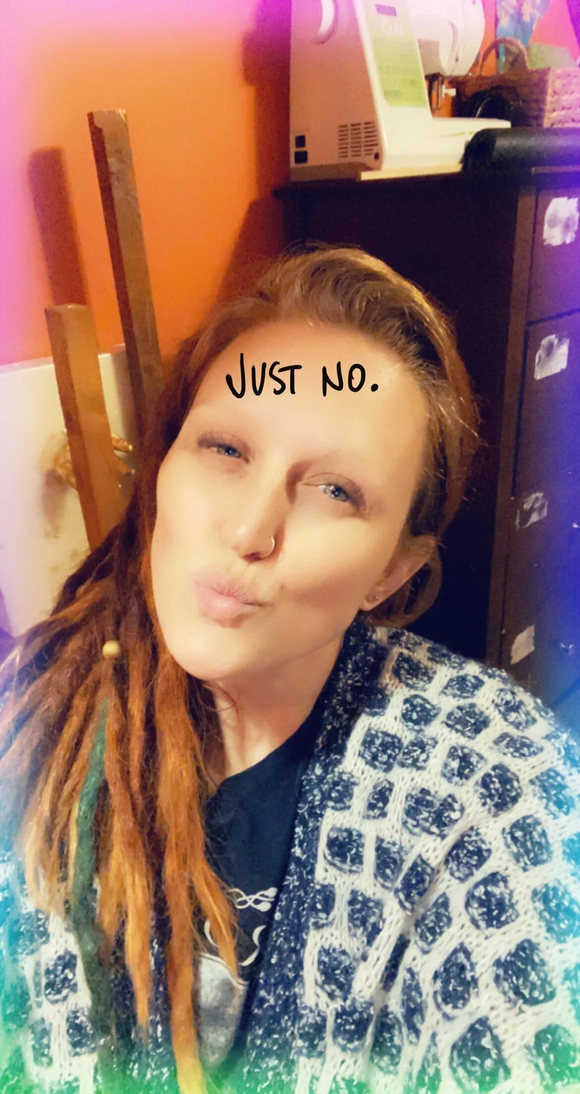
No teeth. I know, I have a smiling photo in my examples (see note about exceptions below), but 99.99% of the time portraits look WAY BETTER without a big ol’ toothy grin.
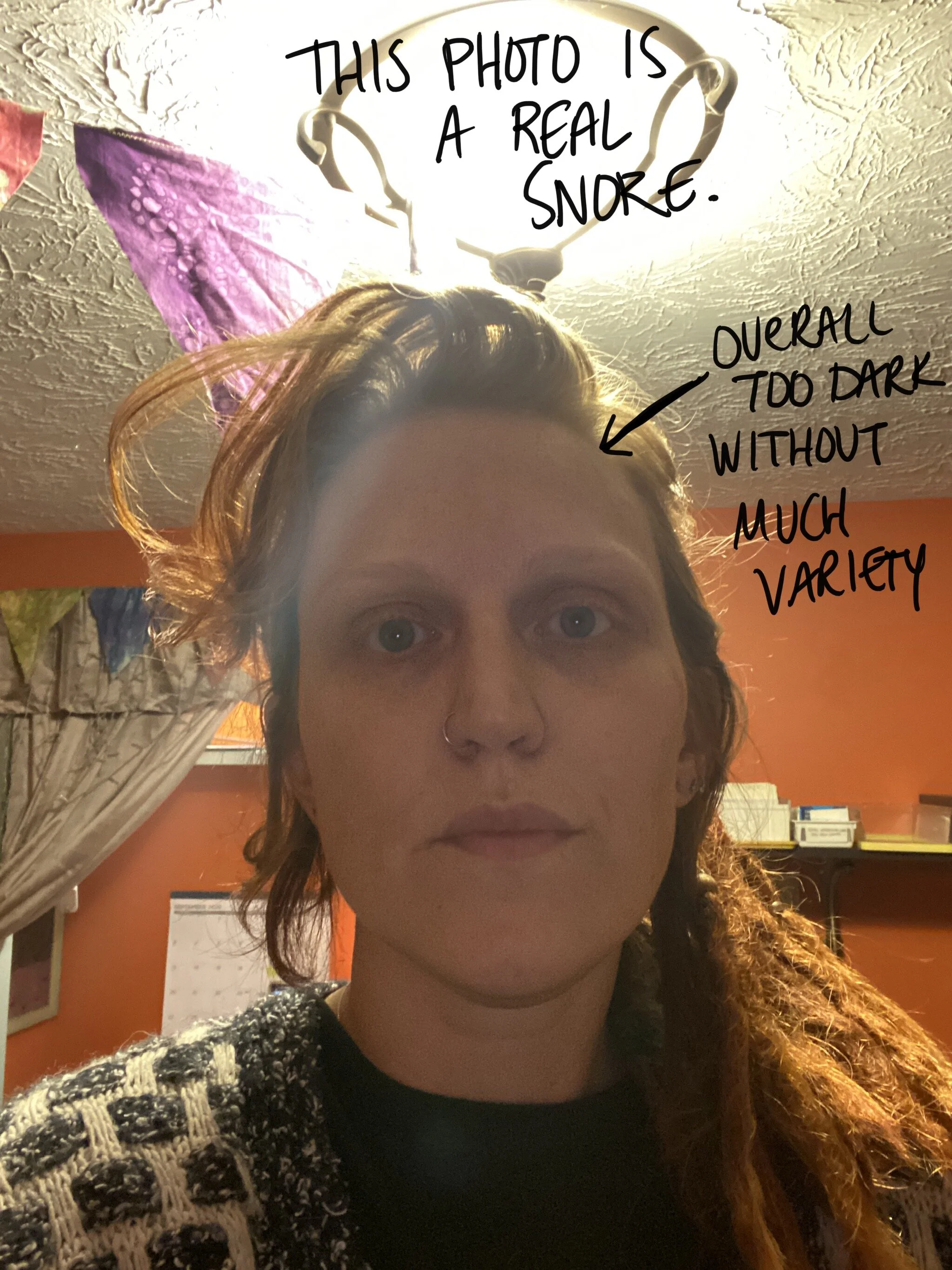
These will be a square format, but I like to crop that myself, so just make sure you send a few (or more-seriously, you can’t send too many) that are not super fuzzy.
*There are ALWAYS exceptions to these rules. Sometimes it’s just hard to decide whether an image would make a great painting. If you have a photo you think is beautiful and it doesn’t seem to meet these requirements, go ahead and send it. And if you’re not sure about something, just ask.
Check out the images below for some helpful examples. Once your order is placed, send photos to sassawilkes@gmail.com. Make sure your name/order number/other identifying info is in the email so your portrait gets to the right place!